Week 6 – Art Activity – Shocking Art!

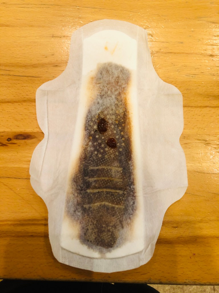
This idea stemmed from the stigma behind periods, despite just about 50% of the human population being people who endure them. Periods are such a stigmatized topic among thew majority of people that it has prevented many from being able to deal with issues surrounding the topic. Even in commercials for period production, the product’s absorption is demonstrated with some blue laundry detergent-looking liquid because even red liquid is too “shocking.” This photo is her to show that periods are not in fact light blue, same consistency fluids. Periods are messy and gross, and they are for the most part not pretty. This isn’t to say that periods are gross and we shouldn’t talk about them, but that periods vary and we need to talk about them. We talk about our symptoms of a sickness in detail because its important (a wet cough or a dry cough, a runny nose, vomiting bile or vomiting food), just as we should talk about periods.

As a female who has a period, it is obvious to me that misinformation is out there. I used to think that the “chunks” in my period were abnormal because period was just supposed to be smooth, liquid, and blue according to commercials. I admit, I didn’t think my period was supposed to be blue, but the clots and color were, to my knowledge, not normal. However, since the clots and darker color were consistent with my period, I carried on. Only later in my life did I find out that clotting was normal, since the period was not just blood, but epithelial tissue being shed from the inner lining of the uterus. Also, the darker, or brown color, simply meant that the discharge was older and took longer to leave the uterus, which again, was normal. As a person who had to find this our years into having a period, that information is something I want to pass on. The only way to pass on that information is to be able to openly be able to talk about periods without fear of “grossing people out.”

With this photograph, I believe I accomplished my goal. In all honesty, I was not menstruating when this project came around, so the photo was my best recreation of my own menstruation using soy sauce, barbecue sauce, and sriracha sauce. If someone with a similar menstruation discharge were to see this, they may feel a little more comforted to know that someone else had a similar experience. However, just this photograph can not change the way the majority of people view periods and how they talk about them. In a different scenario, I would be able to do so with a series of photographs or creating a video with many people talking about their periods. In an even bigger scope, I could have advocated for reform on sexual education in schools to include a more in depth discussion on menstruation. All this would still be “shocking” to most people in today’s society.

“Shocking art” is a powerful tool in displaying topics that people seem to try to avoid talking about. Periods, in my example are shocking because that simple image is revolting to many, which was my point. In order to normalize a natural process like menstruation, we need to expose it. Otherwise, people will continue with their misinformed opinions that women should just “hold in their periods” instead of fighting for the removal of taxes on menstruation products. Another topic this form of “shocking art” can be used on is homelessness. If I had more time, I would have photographed a camp created in LA under a bridge above a portion of the LA river. These types of situations that people are put in are not shown to the majority of people, but they should be if we are to begin to solve them at all.
Week 6 – Artist Conversation – Ricardo Corona & Ana Alvarez

Artist: Ana Alvarez & Ricardo Corona
Exhibition: The Enchanted Borderlands
Media: Illustration
Gallery: Dr. Maxine Merlino Gallery
Website: Ricardo Corona (ricardocoronaart.com)
Instagram: Ana Alvarez(aadorisart), Ricardo Corona(ricardocoronaart)

Ricardo Corona is a Pre-Production major in his senior year, who was a transfer student from Riverside City College. From the beginning, Corona knew he wanted to be involved in animation, but the specifics were never as clear, until he found Background Painting. He chose to pursue that and when he started at Long Beach State, he steered toward visual development and concept art. Throughout his career at Long Beach State, he discovered an interest in combining different themes that weren’t normally placed together to create something new. For this exhibit, Corona’s goal was to combine fantasy and the wild west into a cohesive new theme called “Mythical West.”
Ana Alvarez is a senior in the Pre-Production major who transferred from a community college in San Diego. The idea that drew Alvarez to art was the storytelling that could be accomplished through it. She wanted to create new stories through every part of the process like world building, landscapes, the details in clothing design, and character design, which is her forte. She enjoys every part of the process and has fun while doing it!
As a team, “Mythical West” was always the goal for them. When deciding on a theme, or idea, this was the one that stuck out most and which resulted in a completely refreshing take on the Wild West.

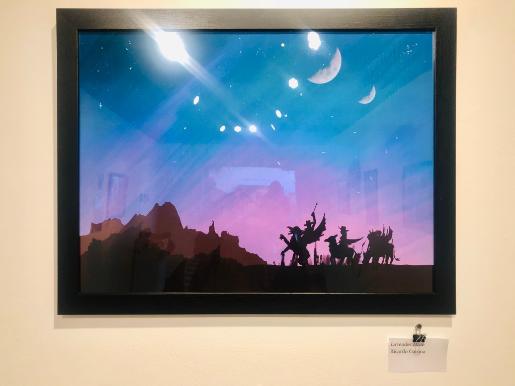
Ricardo Corona’s piece Lavender Haze is a moderately-sized piece. The piece illustrates clean lines and silhouettes over a gradient sky populated with two moons and small white stars. The almost monochrome cool colors contrast the farthest red-brown mountain, giving the whole piece balance in color. The purple and blue in the sky are not over-saturated, but a good mix of pastel and vivid. The black silhouettes add a stark contrast in the piece. There is a distinct separation between the foreground and the background because of Corona’s use of line and color. The silhouetted figure farthest to the left has the most dynamic lines in the pose. Although simple, the piece is powerful in conveying its message.
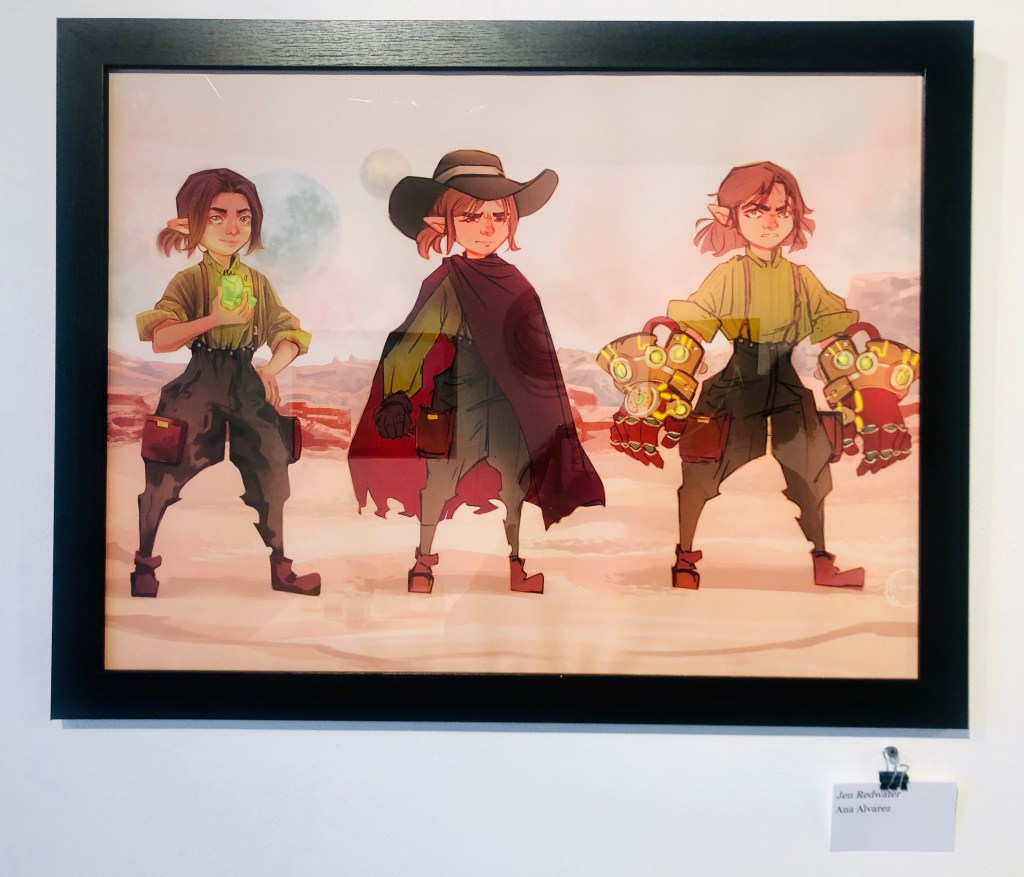
Ana Alvarez’s piece Jen Redwater consists of three versions of the same character standing side by side. The piece displays various versions of a character’s design. The piece mostly consists of variations of the complimentary colors: red and green. Throughout all the versions of the character, there is a strong influence of jagged lines, especially in the pants, that create a strong, recognizable silhouette of the character. In the variations, there is one holding a gem, another with a cape and hat, and the last with over-sized gloves decorated with pieces of the green gem from the first. The figures feature a variety of hairstyles as well. Each character design is separately distinct, but still part of a whole story.

For both artists, the goal of this exhibit was to create a new kind of world. A mix of the wild west and fantasy created their theme of the “Mythical West.” Throughout the pieces there is a new collaborative world built. Through Corona’s background design and Alvarez’s character design, the exhibit creates an alternative universe where elves, magical gems, and hippogriff-riding cowboys coexist. The exhibit exudes a feeling of fantasy and wonder. There is a curiosity to get to know more about the world and meet the characters to be able to hear their tales. Their goal of exploring a newfound genre was met and even exceeded as their exhibit transforms the space of the gallery almost into a museum of another world.

Walking through this exhibit was like walking through Disneyland. The artists’ collaborative work created a space that transported me into the world they created. The works together, gave me a feeling of wonder and curiosity. The pieces themselves are very serene and calming. Each character adds to the story of The Enchanted Borderlands, yet comes with their own story. In Alvarez’s piece Jen Redwater, the character comes with a story of hard work and intense engineering. As an engineer, I related to the character in her way of creating something from raw materials. Although the character created something physical from a raw mineral, I create code of new ideas from building blocks. A piece like Corona’s Lavender Haze is serene with a hidden surprise. When seen from afar, the piece is mystical, but when the silhouettes are seen, there is a spark of excitement in seeing cowboy-like figures riding mystical creatures. All in all, the exhibit was exciting and the artists’ collaborative work made it feel like a whole world built to be explored.

Week 5 – Art Activity – Storytelling Photography

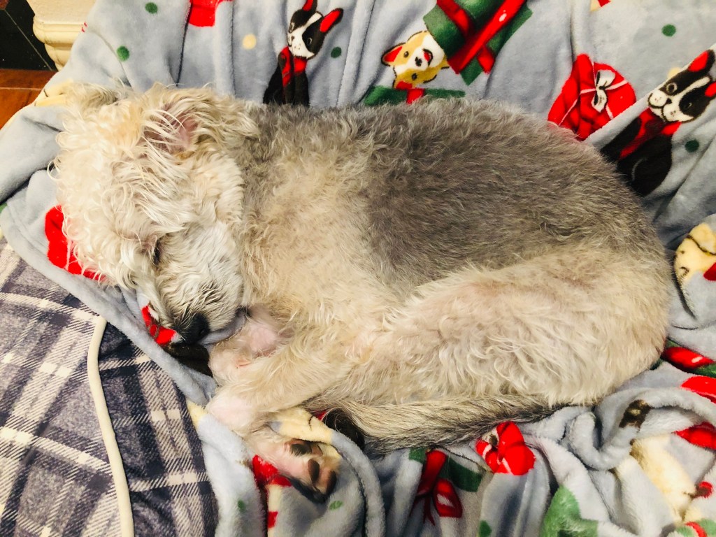
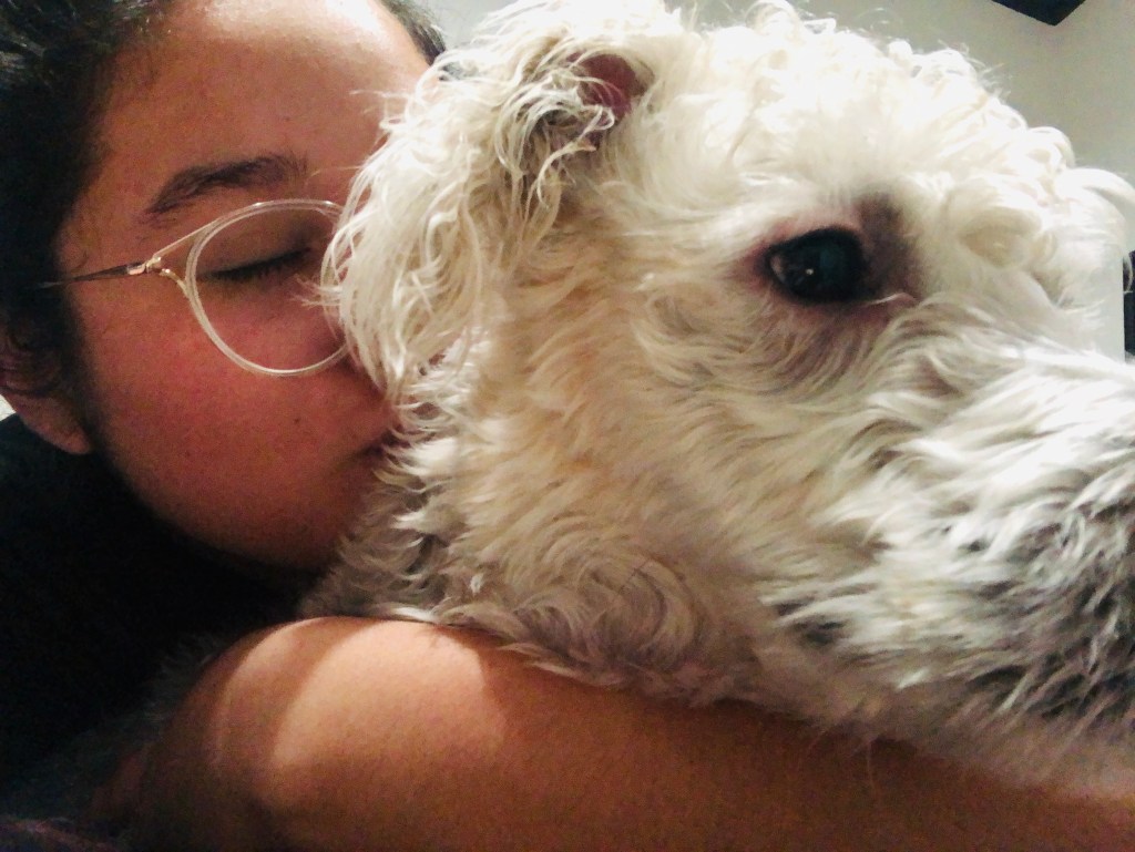
Photography is a strong form of storytelling. Many people agree with the saying “A picture is worth a thousand words,” and for good reason. Sometimes when talking to someone or writing something, words can not quite express what a person is trying to say. However, a photograph is able to convey emotion and a series of events with a single image. Thy can be used to capture moments or tell tales in such a variety of ways and that’s without editing. Using editing programs on photographs, people are able to convey something that perhaps does not exist in real life, like how a building will look on an empty plot, or a scene like a dream. I chose to tell the simple story of life with a dog. I have had my puppy for less than a yet, and he is my first dog. Before then, I had no clue what life with a dog was like. I wanted to share some of the emotions and stories of life with my pup, Alfie.

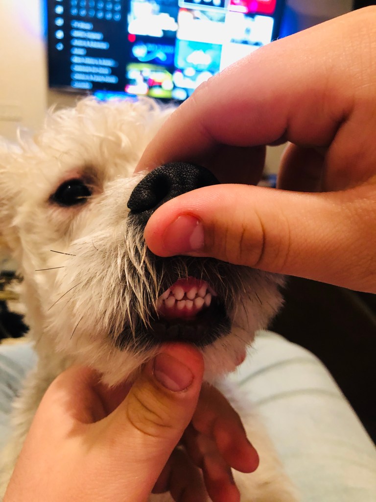
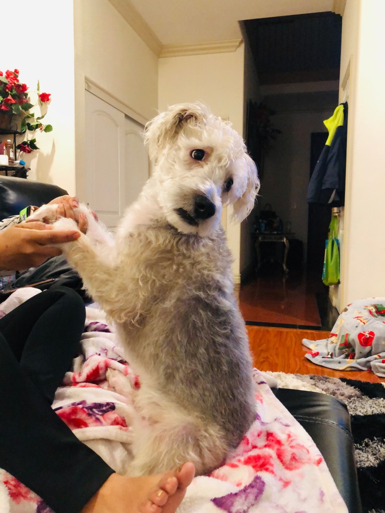
I loved executing this project simply because I loved documenting the little moments I saw with Alfie. From sleeping to playing to cuddling, there were so many fleeting moments I missed just because I didn’t constantly have a camera ready. However, the moments I did capture were representative of the moments I enjoyed. In this series, the picture I think was the “best” was the silly picture of my fiance moving Alfie’s lips away to show his little teeth in the middle. It is such a fun image and so indicative of the funny little moments we have with our dog. Overall, I thought the images told a good story of the moments a person sees when they have a dog. One of the weaker images I believe is the one of Alfie sitting in the upright position looking off to the side. As a photo, it is not the most exciting form of composition, but as a part of the story, it shows the silly things our dog will let us do with him, like sit him straight up.

If I were to do something different with this photo series, I would include more of the mundane images, like feeding him, taking him out to the bathroom, or the veterinarian visits. For this series, I wanted to emphasize the little happy moments we sometimes take for granted. As a dog owner, there’s the “puppy phase” when we are all absorbed in everything a dog does. As time passes, there’s some disinterest in every little moment. It is normal for interest to fade, as it does with most things, but I wanted to showcase little moments that happen often that are taken for granted. For example, the photos of Alfie sleeping show two different instances. One, where he is all snuggled up and looking peaceful and happy and the other where his eyes are half open and he looks silly with the whites of his eyes showing. It is something I felt I could share that maybe someone without a dog would find sweet or funny, and that was one of the objectives of this series.

Other photo stories I would like to tell are the struggles of living paycheck to paycheck. For that to happen, I would have to have access and permission to photograph other peoples’ lives to get a true representation of the situations people go through. Although me and my fiance live paycheck to paycheck, we have a unique advantage in that we are living with my parents in a fairly comfortable home and my mom still cooks for us every once in a while and we are able to use their groceries, appliances, and resources. For someone not in our position, the reality of living paycheck to paycheck looks very different from our reality. In order to tell the story of struggling families, I would want to adequately express the true struggles people go through having to make rent, pay for their own groceries, and even support their family. A photo series is a powerful tool to be able to portray this reality.

Week 4 – Artist Conversation – Jean Iwohara

Artist: Jean Iwohara
Exhibition: Glass Eyes
Media: Painting, Illustration, Sculpture
Gallery: Dr. Maxine Merlino Gallery
Website: jeaniwohara.weebly.com
Instagram: @jelly.jean

Jean Iwohara is an undergraduate student at California State University Long Beach studying in the College of the Arts as an Illustration major. Iwohara is working toward her Bachelor of Fine Arts in illustration. She is currently in her last semester of her fifth year here as an illustration major. Her work in this specific gallery was less oriented toward illustration, which she describes as commercial or editorial work, and was more geared toward painting. Illustration, in her perspective is more finalized or commercial. She mostly works in acrylic and gouache when creating her art and attempts to work in digital if possible depending on the work of art.

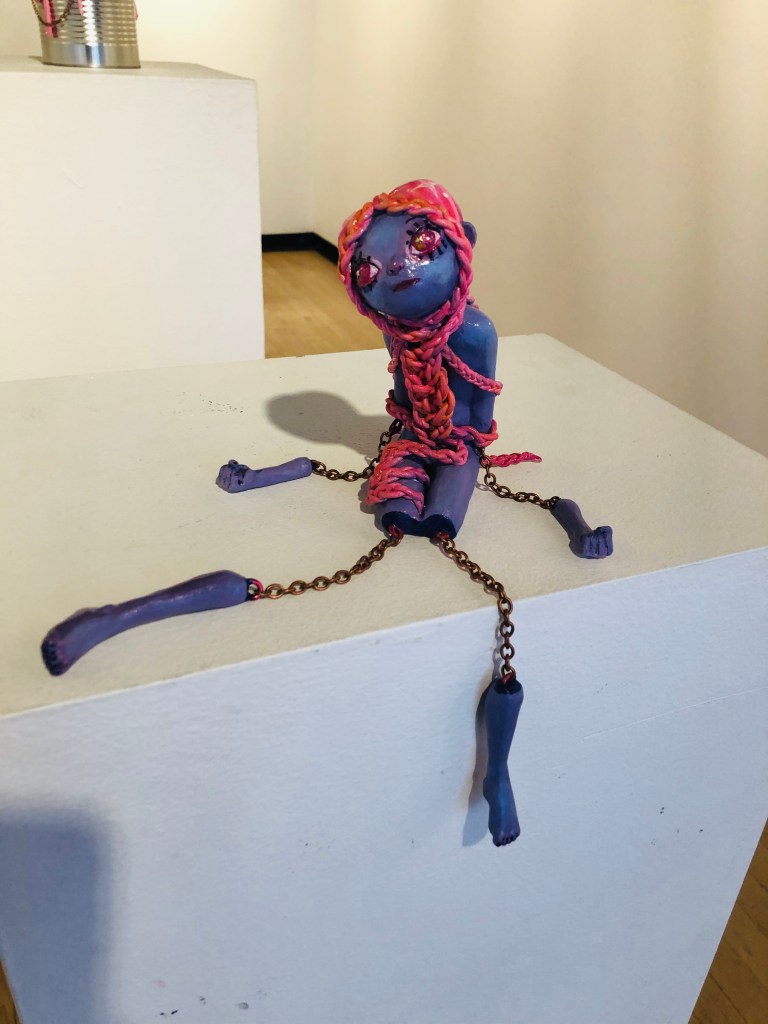
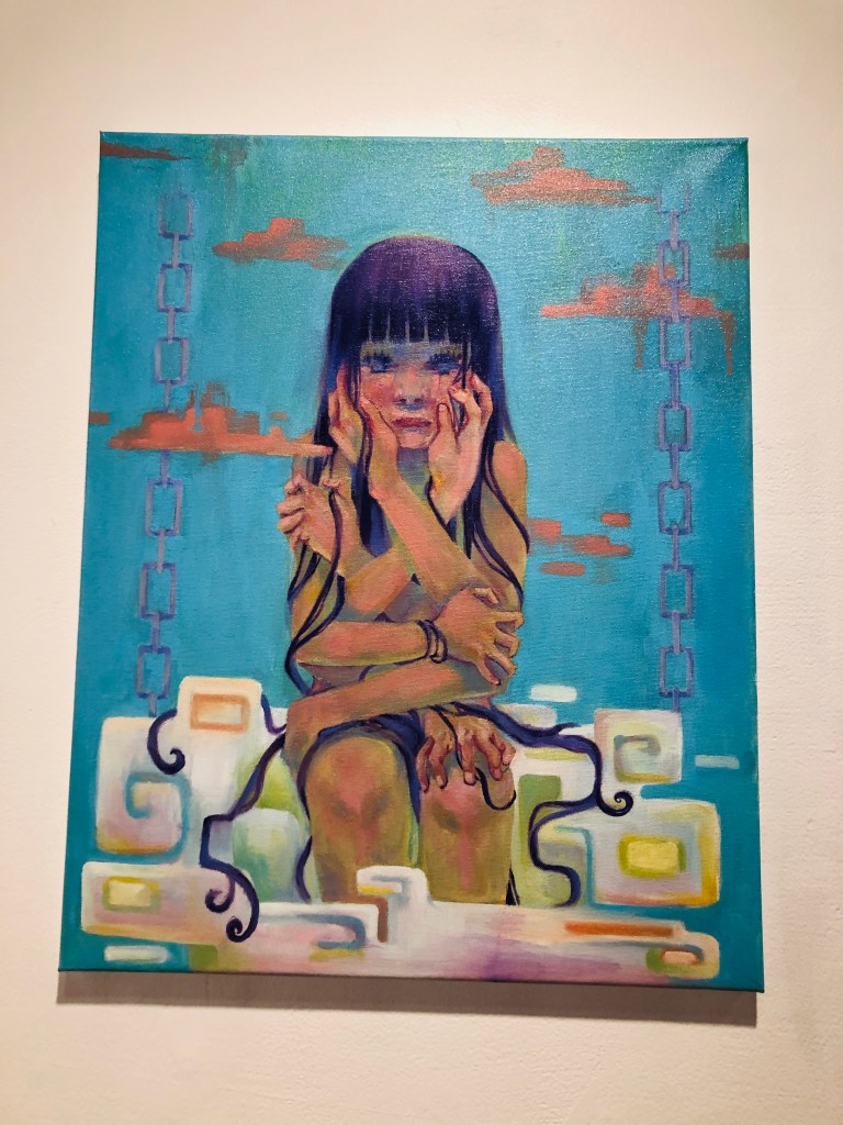
Within the gallery, Iwohara had on display two sculptures and 6 paintings. As a whole, the colors were pastel and vibrant. Iwohara used colors like pastel blues, deep purples, and bright and light pinks. The art all had the same tone brought by the overwhelming purples and pinks. The sculpture that caught my attention was braided. It was small in size, and made you move closer to see the details. This specific sculpture had many intertwined lines forming a sort of braid or rope that enveloped the purple figure. There were also copper chains attaching the limbs (arms and legs), which had been dismembered, back to the torso. The braids and chains had the same texture of being looped within each other with links. The main colors, purple and pink, were vivid but not bright. They complimented each other well for the work. As for her other pieces, there were many geometric shapes and straight lines within the majority of the works. The purple and pink also appeared in the majority of the rest of her pieces in the gallery.

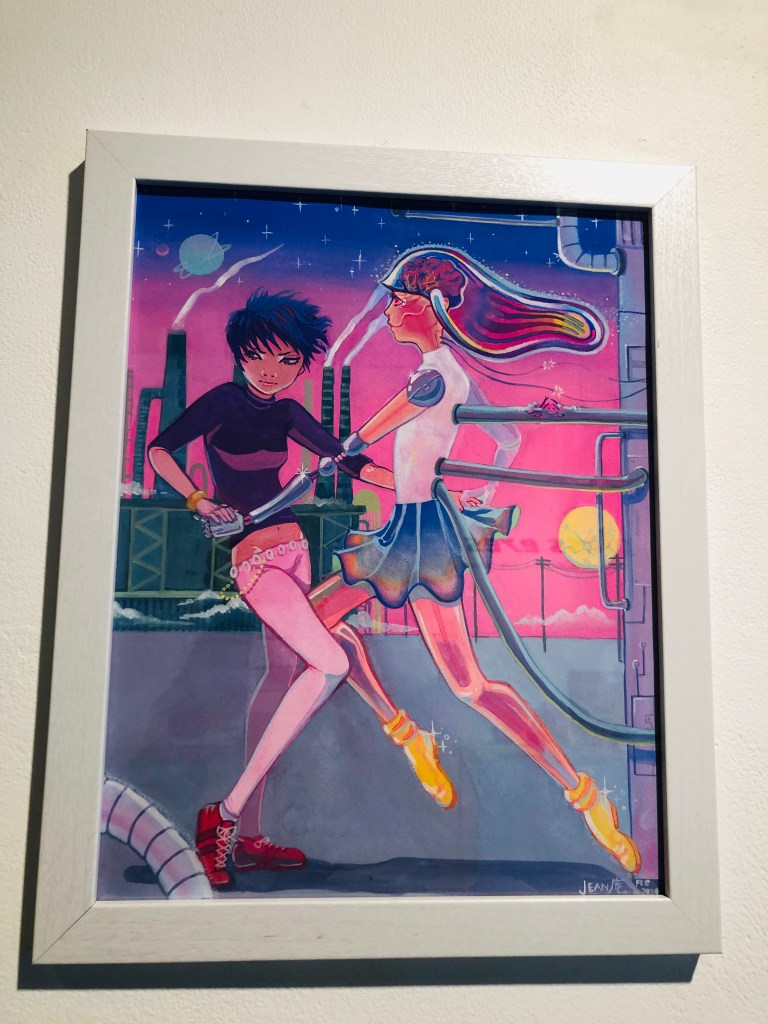
The works of art presented in this gallery by Iwohara were about anxiety and the internal and external forces that create that anxiety. In her work, she portrayed intimacy and femininity in different ways. For the braided sculpture, Iwohara portrayed the pressures of femininity through the braids coming from the hair, a strong symbol of a woman’s femininity, trapping her and strangling her. The figure in the piece is disembodies to symbolize that pressure that comes with having to live up to the standards of portraying yourself as feminine even if that is not who you are. In Iwohara’s dance with me illustration, there is a definitely struggle between femininity and the individual’s personality. It seems like a constant internal fight between fitting in and learning the ways of being a woman and being true to yourself. The same work expresses the anxieties of growing in a world with overwhelmingly incredible but also harmful technological advances. The looming factory in the background i presumably the one that created the exquisite dancing robot girl. Although the product is pristine, the effects of its construction and fabrication are not. Such themes provide for a deep reflection at our own world when reviewing the work.

As a viewer, I related deeply to the works. The themes of femininity struck a cord with me. As a female, I struggle with not meeting the expectations of society of being feminine. Looking through the work, I personally felt the struggles of having to do what society expects of me versus doing what I want to do. Being in the Computer Science major, which is a male-dominated major, I feel a push and pull between wanting to portray myself more like the people in that major versus the pull of having to express myself as more feminine. My personal perspective is that no person should be forced to express certain long-held views of being feminine or masculine. In our Art class, some students expressed their views that women should be the people to care for a baby after it is born because they are more maternal and just better at the task by nature and although I do feel as though I would be maternal toward my child, I do not feel that it should be expected of me to care for the child. In my life, I feel that my husband will be the one to take care of the baby after it is born for more practical reasons. Obviously I may have to pump my breast milk to support the child, but as a person who is gearing toward having a career in the technology field, it would be more beneficial financially for me rather than my husband to go back to work. Being expected to be the “stay at home mom” places a pressure of being judged on me. So, seeing those inner thoughts displayed in such a beautiful way in the works in the gallery were powerful. Iwohara displayed great topics in a very compelling way.

Week 4 – Art Activity – Drinking & Drawing

Drinking and drawing is such a popular activity that businesses have been created and have flourished from its popularity. This week, we decided to drink (nonalcoholic drinks) and sketch a few subjects.

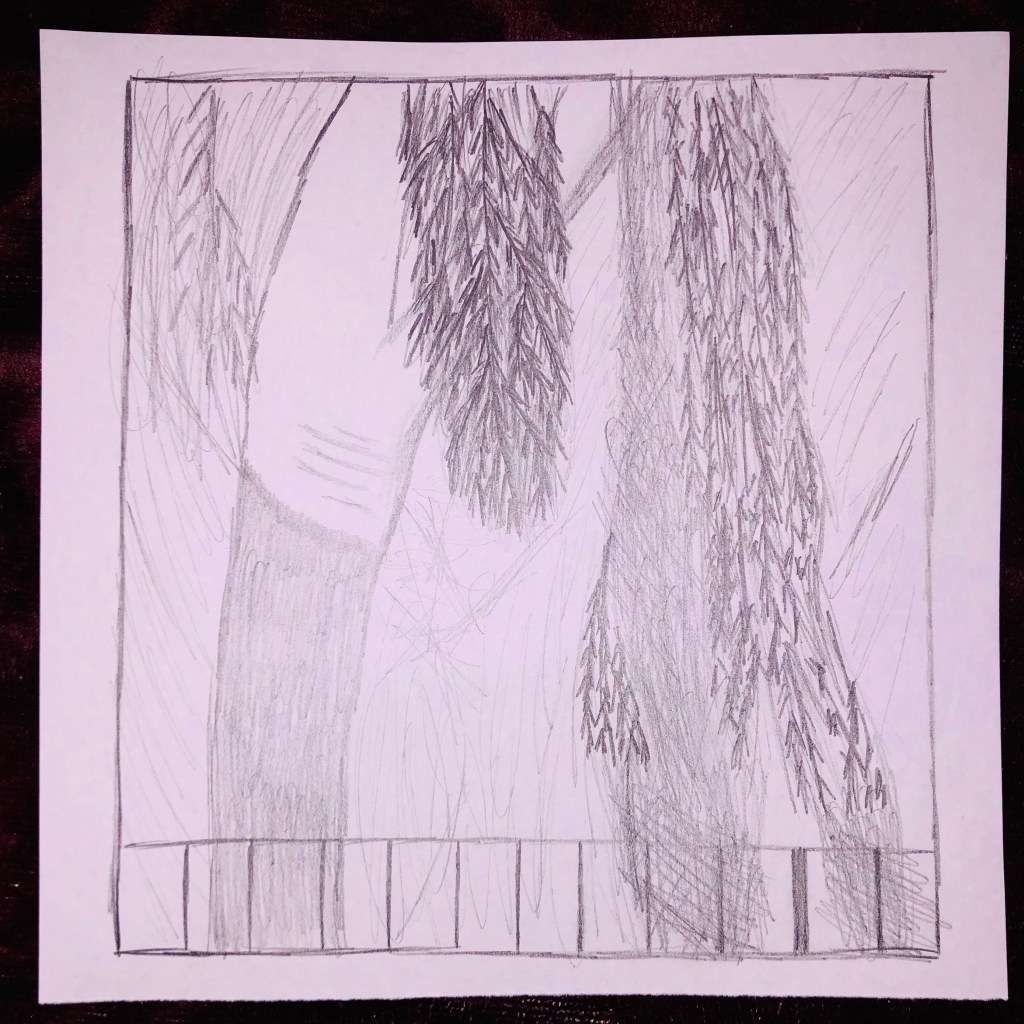
First up was trees. The second picture of a tree was actually the first I sketched. This one was frustrating to draw. As a non-art oriented person, sketching is not my forte. It was difficult to draw something that was so complex while also trying to capture the spirit of it, or the feeling of the movement. This particular tree was blowing in the wind and that’s what I tried to focus on while drawing, however, I do not believe that is what came across. However, the first picture of the tree above was the second to last that I drew, and that one I was more pleased with. Even a while of practice made a difference in the quality of the work. Also, I focused on the details more, attempting to look at the subject more than at the paper. In the end, the attention to detail paid off for me.

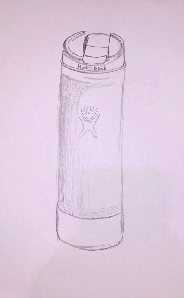
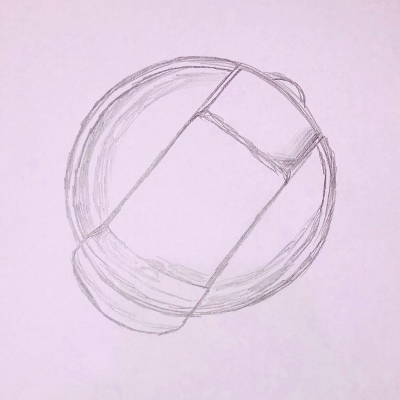
Next, we had the drink. My drink was a warm tea in my light blue hydro flask. In these sketches, I tried to focus on the detail and being more calm as I sketched. For me, the tea is a daily occurrence in my life, functioning as a light boost of caffeine to keep me going in the day. It is a calm, ever present detail of my day and I felt I captured that in the sketches. It is not a fancy, over-the-top drink, but a staple and simple aspect of my day. I worked with the shadows here to attempt to push myself into the art more. Although difficult, I was pleased with how the shadows turned out. I was the most calm making these sketches than any others and that definitely reflects the feeling this drink brings me.

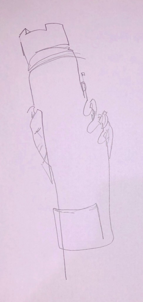
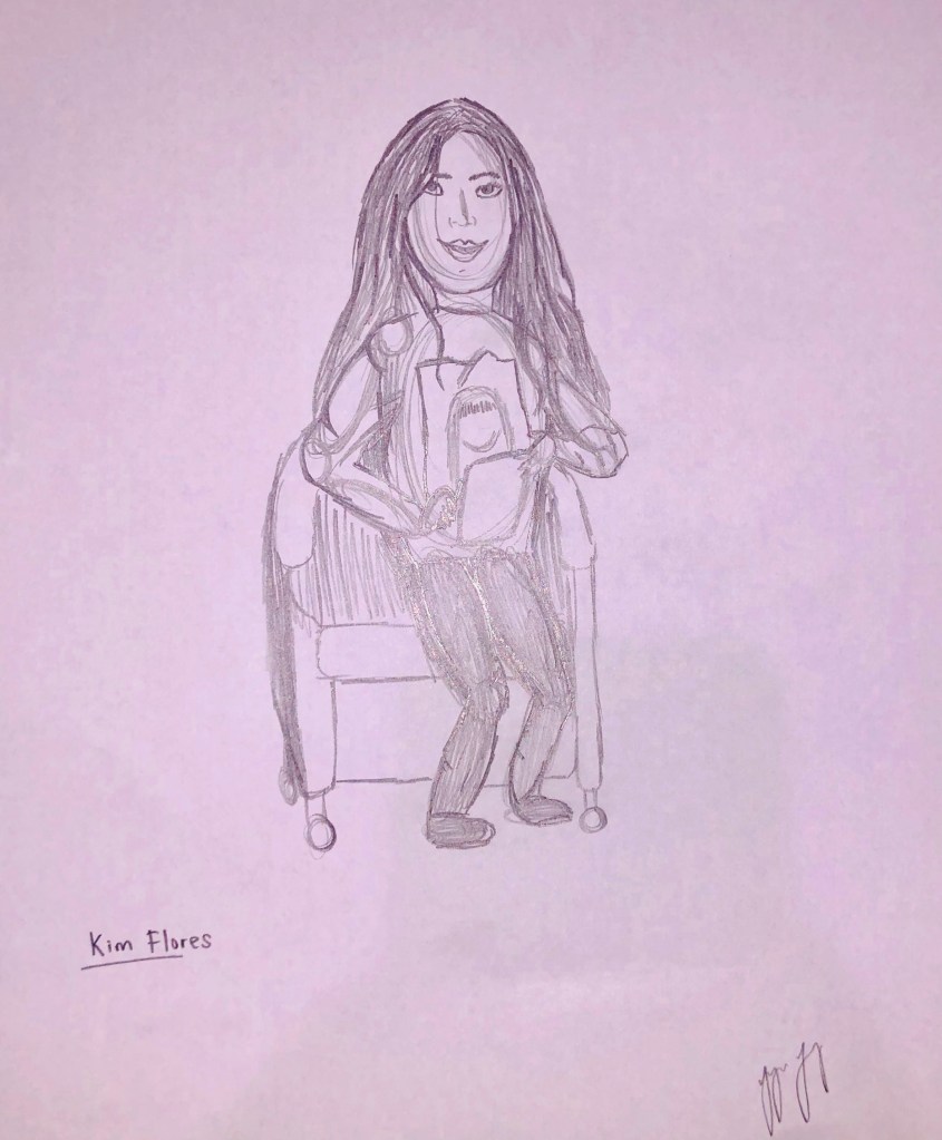
The final subject was people. This subject was the one I most dreaded. Drawing people is such a difficult subject that some artists try to avoid it completely. For me, there was a dread of drawing another student and doing them injustice. The first drawing of a person was a blind contour of my hand holding the drink. In middle school I took an introductory art class and one of our assignments was a blind contour drawing, and I remember enjoying them so much that I decided to go at it again. I think the sketch shows my struggle with it in a quite comical way which is exactly how I felt while making the work. However, having to focus on the subject and not the paper helped me see some benefits in paying attention to detail. As fir the sketch of a fellow student, I drew Kim Flores. I feel my sketch was satisfactory in my eyes, but definitely not what I wish it would’ve been. It felt frustrating not able to express what I wanted to on paper. In general, I prefer drawing geometric shapes and lines, so drawing a person was a whole different realm for me.

All in all, the drawing experience was a mix of stress, appreciation, calm, frustration, and learning. If I were to practice every day, racking up hundreds or thousands of hours, I feel I could improve my skill. On the other hand, as a Computer Science major, I see little necessity for being able to create a work of art. In reality, I may have to make minor sketches in order to convey my idea of a physical finished product or create squares and lines to map the classes of my code project, but I may not have the need to sketch a person in all their complexities and details. Of course, it is important to have a basic skill, but my skill seems enough for my math-oriented need to draw. Sometimes, however I will find myself having to sketch something out as a picture can say a lot more than words can. We are visual creatures and sometimes that’s necessary to communicate.

Week 2 – Art Activity – Finding Art

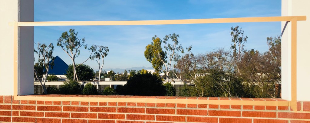
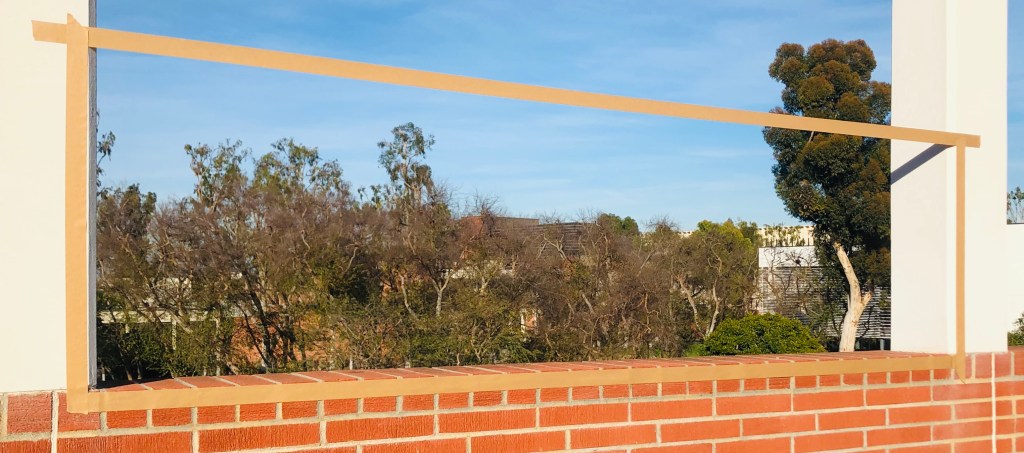
This week, we had the task of a curator to find art in our campus. Armed with rolls of tape and a group of fellow “art curators,” we marched the campus to create a frame around works of art. The piece we settled on as a group was a large piece. Depending on the viewing angle, (like the two examples above) the piece could have been monochrome or brightly colored. From most angles, the piece is textured and dense. The elongated length of the frame restricts the point of view so that the viewer sees the piece as a horizon rather than a picture as most works of art are presented. Through most views, the contents are dense in lines as the frame helps exclude the empty sky above.

The art is pleasant and calming. For CSULB students and faculty, who are most likely the viewers, the piece is relatable and familiar almost adding a reminiscent quality. This piece of art is meant to provoke the viewer to see something different every time they see the art. From one view, you see the group of trees bunched together and the engineering buildings behind. From another view you see the buildings and the famous CSULB pyramid gently in the background. Like all art, it is subjective depending on what you see, how you see it, what you notice, and how you perceive it. In this piece, you get a different experience every time you see it and that experience may be different from someone standing directly next to you viewing it as well.

Before we came along and created a frame with the scotch tape, the view was not “art” per se. By creating a frame and forcing people to see the view through a frame, we made it art that was meant to be viewed and pondered about. As was the case for most, if not all, of the groups, the subjects were not art until we encased them in the scotch tape frames. The art also did not necessarily depend on the object or subject, but in the combination of tentative thinking and the fact that the object was framed. When the viewer attempts to ponder the meaning of what is within the frame, then the subject becomes art. Some object lent themselves to become viewed as art. One group, for example, framed a small plant growing from between two strong concrete slabs. Something like this sends a strong message of beauty growing in the face of difficulty and challenge. Something like that plant may lend itself more readily to the idea of being art rather than another object like another group’s framing of a bike rack pole structure. However, as we saw many different objects and views were classified as art.

There are so many different types of art. From 2D to 3D and abstract to realism, there is a type of art for everyone. In our class, some people chose views, which represented more of a 2D-style piece and others chose 3D objects. One group’s art caught my attention in particular. The group that framed the escalators of CSULB created a particularly intriguing piece. The movement of students and passer-bys walking through added a whole new level of interest. Pieces like this show just how different art can be in each person’s experience. For someone watching the escalators during rush hour, they may see the business of peoples’ day to day and the distraction in everyone’s purpose of getting where they need to go. However, for someone watching the escalators in a calm moment, they may ponder about each person individually rather than the hoard passing through and the general implications. This activity showed us how different art can be from one piece to another.

Week 1 – Art Activity – Finger Painting

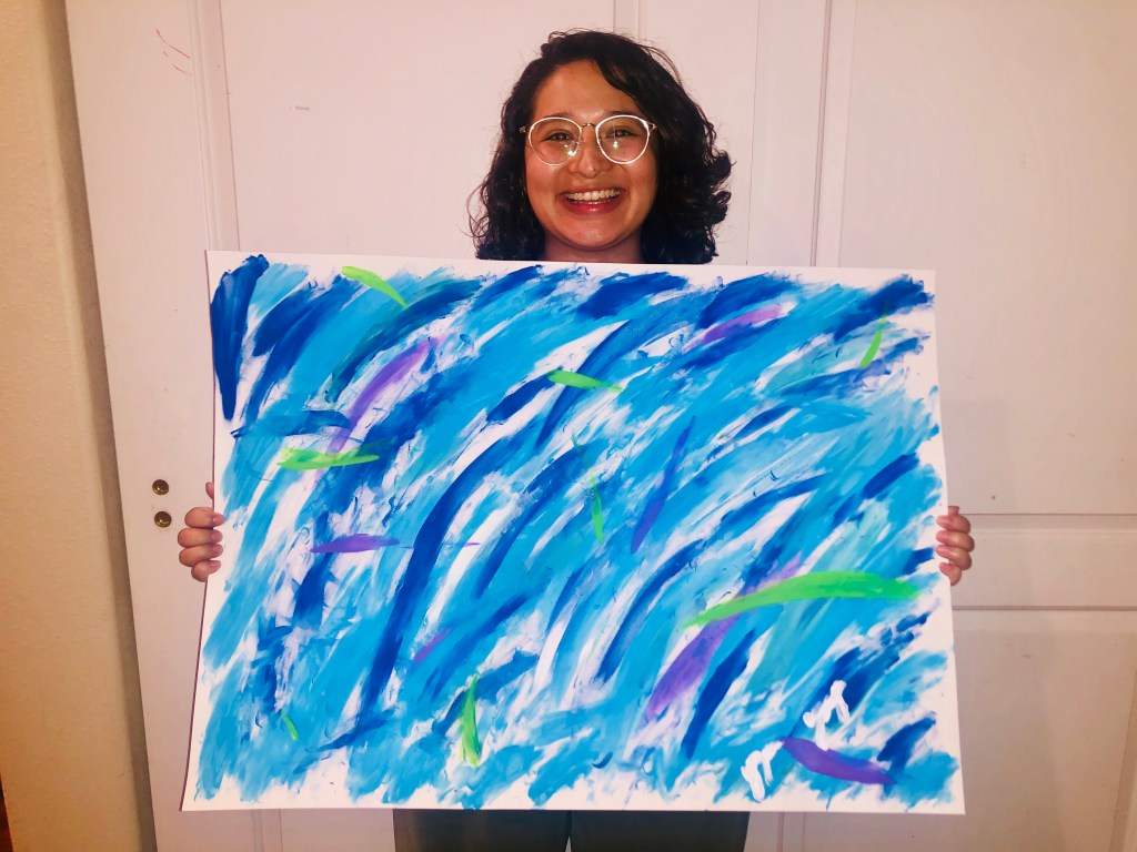
In order to immerse ourselves in the idea of abstract art, we were tasked with creating an abstract painting. Having no background of art and being a Computer Science major, I had no idea what to expect going into this. My first step was choosing the colors. I chose to work with cool colors not only because blue is my favorite color but because cool colors are generally more calming. Starting the painting, I did not have a clue what to do. I started by dipping my finger into a single color and drawing a streak. I continued to paint different colored streaks until the painting began coming together. I didn’t think it was necessary to cover the canvas. I liked the idea of a kind of free-formed border along the edge. The painting manifested into a portrayal of the earth in sorts, although it was formed through a series of ideas. Mostly, the painting portrayed my emotions at the time and my thoughts as they lingered. I enjoyed the swaying patterns and the pop of green and purple splashes. In the end, I enjoyed the experience and the finished product. 

Finishing the painting was harder than I expected. Abstract art is difficult to perceive but also difficult to create for a novice artist. Not only did I not know where to start, but I also did not know where to end. When you’re not painting a specific item, it is difficult to say when the painting is done. Is it done when the canvas is covered? It is done when the colors look good together? Is it done when I get tired? These were all questions that ran through my mind while I was painting. In the end, I decided to stop when I was satisfied with my work. This is a lot different from what I might do if I made a representative painting, in which I would stop when I thought the thing I was painting looked enough like the thing in real life. Abstract painting is different in that there’s no specific end goal. That was freeing in a way, but also made me anxious in whether I did enough or whether my art was enough to be abstract. All in all, I was pleased with what I created and even a little surprised at how fun the experience was. 

Compared to other paintings, abstract paintings are very different. I used to see them and think they were easily remade. I thought there wasn’t much skill involved in creating abstract paintings, but through this experience I see that it is very difficult to know where to start, what colors to choose, what patterns to make, what medium to use, and when to stop. Paintings like those of Jackson Pollock used to just look like paint splatters to me, but now I know there must have been a heavy amount of effort and time put into a piece. The amount of emotions put into the work also affects the final piece. There is no one easy way to make an abstract piece of art, just like there is no one way to make a representational piece of art. 

Through this finger painting experience, I was able to gain new knowledge of the effort put into works of art. Through the painting, I felt liberated from the norms of having to create a realistic looking item and could just focus on color and shape and emotions. I still have respect for artists who can transform a canvas into an almost photographic piece, but I have a newfound respect for the skill involved in abstract painting. I still enjoy both paintings visually and each has its own purpose and message. The beauty of abstract art is that it can have many interpretations. Not only is it a painting of a chair or a landscape, but it can be an emotion, a smell, or a sound. There is a freeing feeling in abstract art when you do not have to know what you are looking at. Even though when I started, I felt constricted, in the end I felt free to create what I wanted. Abstract art is a very interpretational kind of art, and that is what gives it liberty.

Week 1 – Art Experience – “Women’s work” is also art.

Cleaning Piotr Kowalski’s NOW

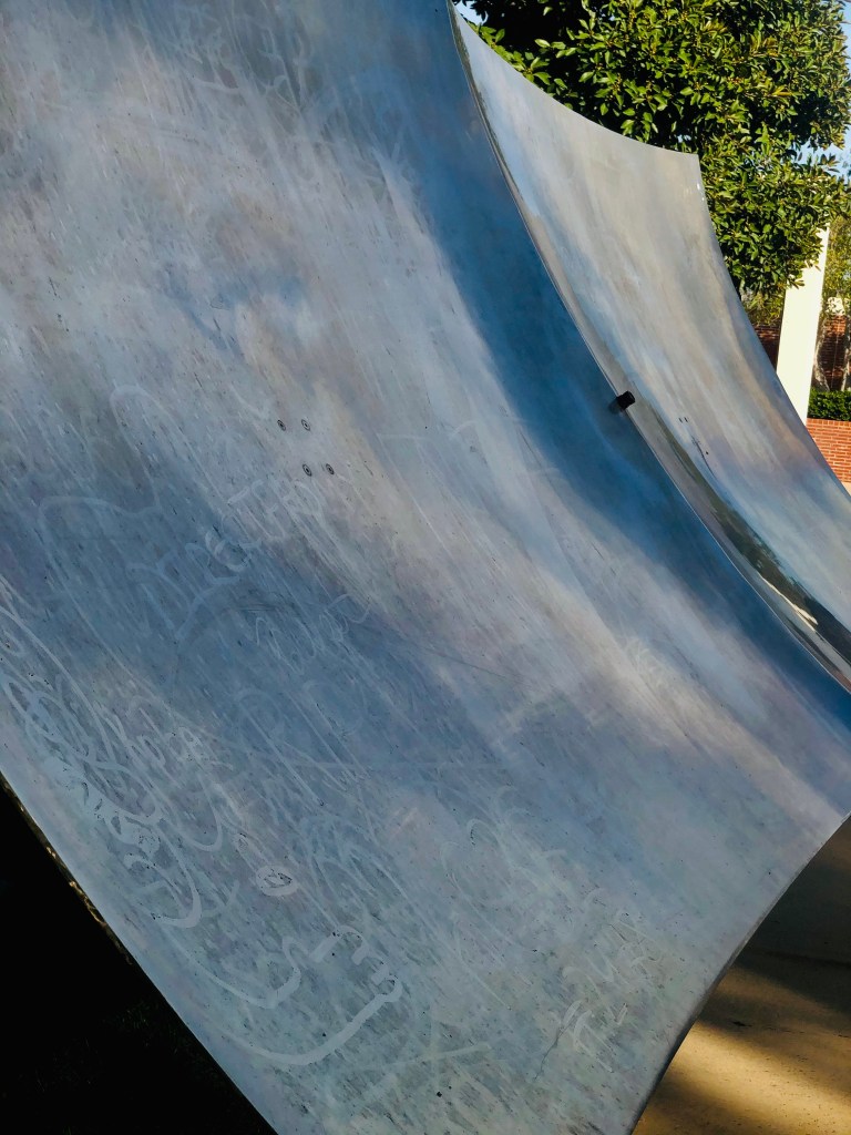
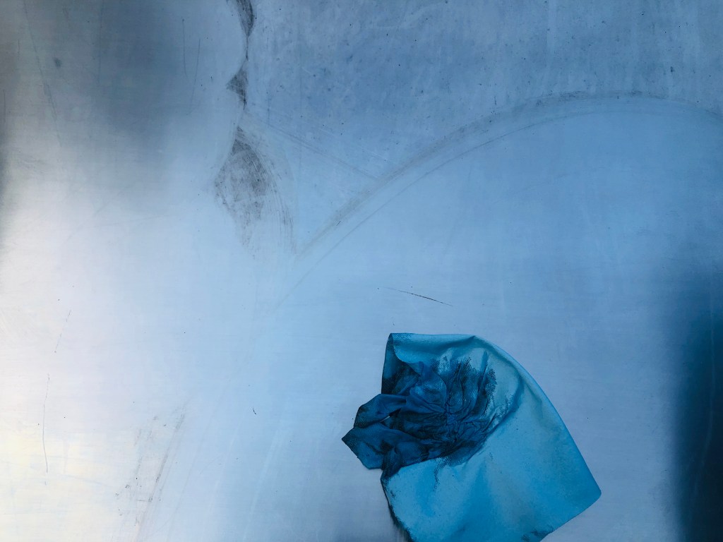
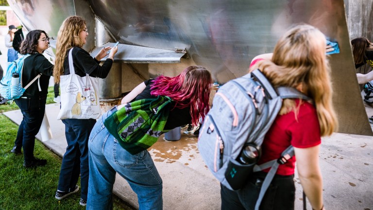
On Wednesday, January 31st, we as a class of art students performed Maintenance art by cleaning Piotr Kowalski’s NOW on our campus at California State Long Beach University. This assignment was a tribute to Mierle Laderman Ukeles’ work of cleaning the steps of the Wadsworth Atheneum Museum in Hartford, Connecticut. The work of our on our campus, NOW, is notorious for being filthy. Seeing it as I passed by day after day took away from my experience of the art itself. I remember seeing it for the first time and being in amazement at what a large sculpture it was but as I got nearer, noticing the finger painted messages in the sculptures dust. This took away from my analyzation of the piece as a whole and made me focus on the details that should not have been there. So when this idea of performing Maintenance Art on the sculpture came up in class, I was pleased to be part of such an experience. 

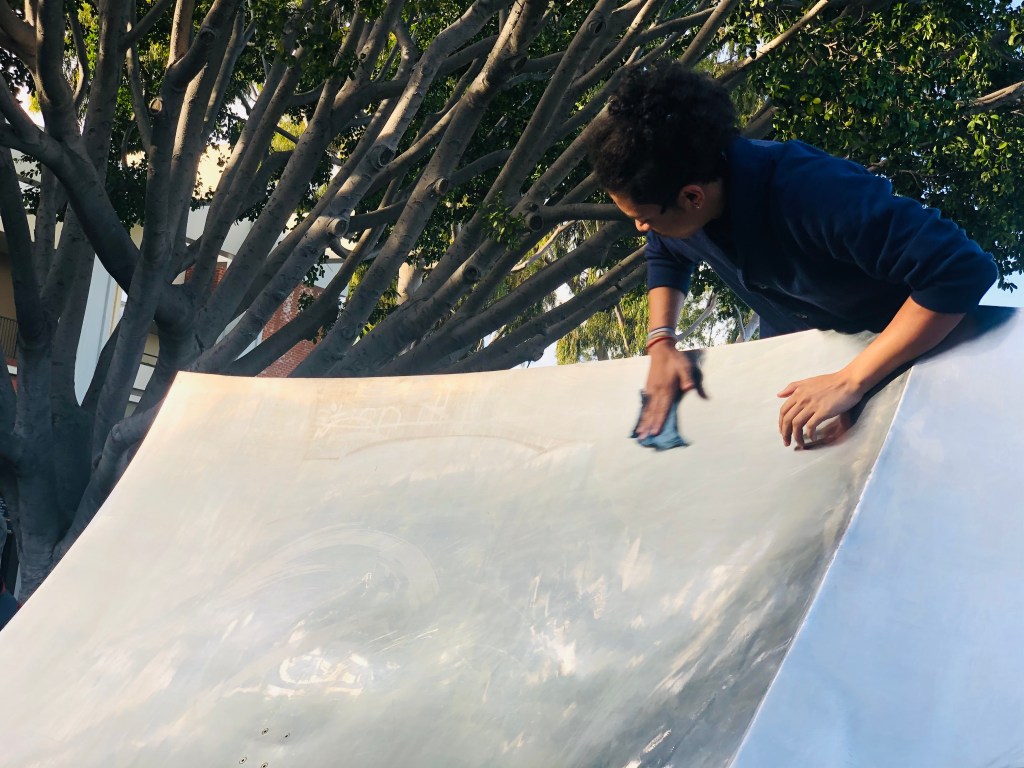
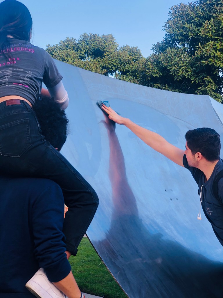
Coming up once again to the sculpture I had ignored after that first year, I once again noticed the markings in thick layers of dust on the sculpture. My anticipation grew when more and more students came and stood or sat near the sculpture. Once class started, students began grabbing paper towels and dipping them in the provided water, myself included. It felt extremely satisfying to be able to see that layer of debris come off of the sculpture, and I understood the idea of cleaning this abstract work. It was impactful to see how performing a simple action could make such a difference in an art piece. What was even more impactful was seeing the group effort of the class working together to achieve this goal. It was truly astounding to see the sculpture transform in a matter of minutes. Seeing the sculpture and being able to experience it in its intended view was relieving. 

(That’s me in the fourth picture all the way on the left!)

Thinking about Ukeles’ cleaning of the steps of the art museum and Richard Serra flinging molten lead against the walls of an art museum gave me two different views of their intentions. Both actions struck me as art because both had the intention of making an impact. Ukeles’ work was about showing a different point of view by removing obstruction and Serra’s work was about showing a different point of view by creating obstruction. If Ukeles’ work had been done as part of a maintenance job, it may not be considered art because it is not the intention. A large part of what makes art, I believe is the intention. That is not to say that anything without the intention of being art can not be art. There are many things that can qualify something as art, but the intention of it seems to be a large defining factor. Other factors, like the medium, can be defining factors of whether something is art or not. However, that does not mean that all works on canvas are art and that all works not on canvas are not art. Certainly a painted house or a painted ceiling can be art. Art, ultimately is a culmination of intention and perception, a combination of how the creator creates it and how the viewer views it. 

The sentence “Womens work” is also art was interpreted by many to mean work that was typically associated with as being performed by women (i.e. cleaning, cooking, housework), is also a form of art. To me, the statement struck as a statement of empowerment. “Women’s work” to me is work performed by a woman. For example, I am a woman and I complete coding assignments and that is my work and therefore is women’s work. In that context, “women’s work” is also art to me is more of a statement of bringing as much importance to the achievements of women as men’s achievements have been. In the past, men have gotten most of the praise as artists, and the statement urges viewers to consider women’s work as art too. Women’s work is art as much as men’s work is art. It all depends on the intention and perception. 

Design a site like this with WordPress.com
Get started